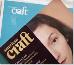
The emphasis has moved from the object to the maker. This is most evident in the cover and its accompanying story. The risk is that it moves into Martha Stewart territory. At the moment, there is enough serious content to resist that. Paul Greenhalgh’s ‘Critics Corner’ raises some weighty issues about the place of craft in the pantheon of art history, though the criticism of craft ideology seems a fairly cheap conservative shot. It would be good to see the magazine feature an alternative line, pointing towards the increased ideological engagement of craft.
Meanwhile, the issue is beautiful to behold. The paper stock has been lovingly chosen. Of particular note is the change to the American Craft logo. It looks disarmingly similar to the Craft Victoria logo, don’t you think?
